Total Pageviews

Sunday, 2 March 2014

Live Brief Convention

Live brief project

 The brief

For my live brief project I have applied for a position at an anime and manga convention based in the north east of England, Newcastle, called NCLCON.  At this venue I will be selling reprints of my artwork, both digital and traditional, at a table stall inside of the convention. To fully apply myself for this position and achieve the maximum amount of potential from it I will need to create new artwork relate to current trends and popularity in anime and manga culture.

The position that I have applied for at the convention is as an independent artist. During my attendance at the actual convention on the day of the event I will be required to manage and maintain my own sales table that will display my artwork for people to view. This will require an appropriate level of presentation and planned positioning of products for customers to be able to view and browse artwork with ease. Also display prices will have to be created to readily inform the audience with greater ease, this will make my stall far more productive.

My action plan towards completing my preparation for the convention is based in three different sections. Firstly is research, to complete this I will look at recent popularity rises in certain anime series. This is to target recent joiners of the anime scene. People who have just gotten into anime usually pick the most recent and most popular series ro introduce themselves into the community. After doing some research I picked a series called Kill la Kill to create fan artwork of. The artwork for this series also targets the fan service markets, as the characters in this TV series are very underdressed. I feel that by picking this sort of artwork I can target the male audience because official posters are not available and also the keen anime fans who watch all the new series.

For my second piece of artwork created for this event I chose a classic anime film to create artwork of. For this I selected studio ghiblis princess mononoke. This is because it’s a renowned film and those who aren’t even anime fans know of it. Majorly studio ghibli films receive a good reception amongst viewers. Ghibli films are usually more female orientated with stories of love and friendship however princess mononoke has that violent edge that appeals it towards the male audience. Knowing this I evaluated it as a good choice to try and sell and maximize my artworks appeal to the target audience.

My last piece of artwork I decided to make none anime related. This was to cater to those who might just be interested and curious about the event or attending with friends and family. I kept this piece related to animation but not to anime and manga. My last piece of artwork was based on Disney’s the little mermaid. Again I chose this because of its renowned visuals that anyone who has seen this film can recognize. All of this artwork will be created digitally as to minimize cost on materials.

The reason I have created different categories of artwork is so that I can complete my task of selling my artwork to the convention attendees and make enough money to break even or gain profit. Success will be determined by how much money I actually make, this will be influenced on the choices I have made in artwork and how popular they are.


Friday, 28 February 2014

Contextual Studies - Coporate Companies

Contextual Studies - Coporate Companies


Hornet Inc


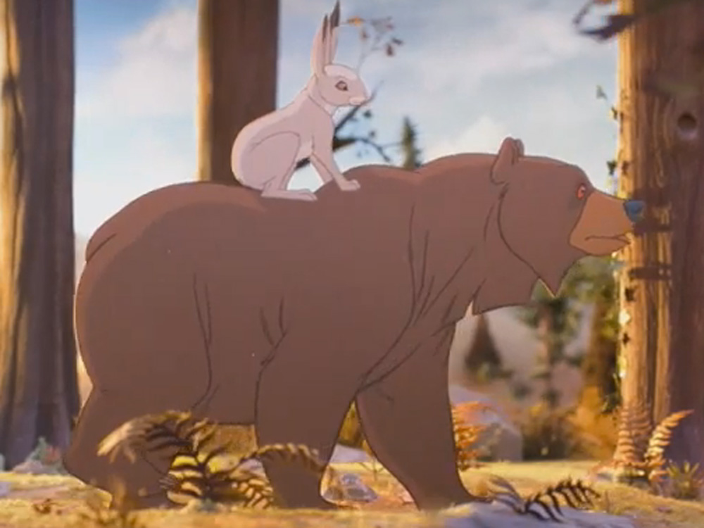
JOHN LEWIS by Elliot Dear, Yves Geleyn


combination of hand drawn 2d animation and stop motions in the background.

Psyop
Not to Scale


Tic Tacs – Conga


Punga


Pepper Melon


Tigo - Commercials


 Tigo - Commercials


Tokyo Plastic


Kitteh Kitteh Scatman from tokyoplastic on Vimeo.

Pleix


Sehsuct


Meind Blender

Weekly Reflection - Loop De Loop Competion - Final Animation


Weekly Reflection - Loop De Loop Competition - Final Animation

As a final review of my animation before i submit it to loop de loop i decided to reflect upon what this module has done for me and made me progress in creating my own animations. I feel that my biggest progress and achievement is learning to use adobe after effects to a greater extent. i feel that this is very important because when bigger module come up in the future at least then i will have some sort of foot hold in understanding what i am doing in my work.  i used to have great trouble with understanding the different tabs and section of the time line when working in after effects. now i feel more confident in understanding the different composition sections and layout of the program.

At the start of the production of my animation i felt very calm and relaxed when working on paper because i had greater knowledge and knew that i was more then capable of completing that portion of my work. however i did feel that when i was not as comfortable and aware of what i was ding in after effects i did start to panic in my work. i feel that this needs to be addressed in future modules as to remain calm and not infringe upon my work ethic. i feel that this would be to much of a threat to further brief completions and the best was to combat this is to remain calm and when coming upon something i do not know i should just simply read tutorials in greater detail to get and understanding before i approach something new.

I feel this past week has been a learning curve for me and that my skill set has improved but not enough. Though i am happy at the advancement i do not feel it is enough and i should defiantly revisit the program in later task to further push my abilities and to only improve more.

My next task after this will be to submit my animation and to see if it is accepted into the competition website.


Thursday, 27 February 2014

Contextual Studies - Animation to Music

Contextual Studies - Animation to Music

Andy Martin - Planet one / Dry Fish


Dry Fish is an animation created by andy martin, it's an animation created to follow the rythm and beat of the background music.the inspiration for the animation came from the series of sketchbook doodles that andy matin developed. Andy created a buch of small illustrations that were loops of animation. He wanted to create music for the animation that would suit the charcters however after he created this music seperatly he wanted to change the pace ofthe animation loops so they fit the music. So in some ways the music was created for the visuals in theme butthe animation worked for the music in tempo and pace. So they build upon each other.
The style is very simple and cute with some quirkiness. i Like how unrefined some of the charcters are as i think it gives them more of a personality. You can also tell that some of hte loops were drawn at different times becuase the art styles have changed over the days depending on how the artist was feeling. had they been drawn at the same time on the same day i think that they would have wound up maybe looking too similar to one another.
The techniques used in this production is a mix of traditional media and importing it into a digital platform for editing and cleaning. these sketchobok doodles were all scanned in and redrawn in photoshop. After completing the cleaning tasl Andy Martin then created the background for the animation in photoshop but before he done this he used imagery that he had collected from japan to further inspire his illustration and the visuals for the scene. We can see this research has influenced objects such as the floating mountains which are loosely based on Mt Fuji and the windows and trees are based on oriental classical homes. Martin creates a huge backdrop for the scene and imported it into after effects which he then set up several cameras close up to certain areas so during the animation he could travel around his image with his characters and make them seem like separate scenes. Production time for this animation was very short and the music, visuals and assets leading up to final production was all finished in two months. I feel that although he could have used far more advanced techniques such as creating 2.5D landscape in cinema 4D that he has went quite traditional and gotten more out of it in style.
I feel that its timed very well to the music and is in sync all of the time and all of the characters while are doing different actions all seem to work in tune together. It starts out quite tame in complexity then rapidly escalates in action and peaks in animation happen rapidly. i feel that this work is experimental judging from the artists starting point from simple sketch book doodles. I personally like this start to his work because i feel that some of the best pieces of work come from random self experimental work because its a personal development in yourself.


Friends with You - Cloudy
 

Beeple - lV . 10


Gal Shked - Love Grenade


Ben and Julia - Tahti Boy and Palm Tree.

Chris Wave - Quimby the Mouse


McBess - The Dead Pirates wood


Wednesday, 26 February 2014

Artist Research - illustrator - Scott M Fischer


http://www.fischart.com/assets/art/artwork/Games/magic/KioraAtua_Scott_Fischer.jpg 


Artist Research - illustrator - Scott M Fischer


Scott M Fischer is an American illustrator known for his book cover illustrations for companies such as Penguin, Collins, Daw and many many more. He has also been voted best selling book artist by the New York times and not only does he illustrate others books but he also writes and illustrates his own children's story books.

Fischer graduated from the Savannah College of Art and Design in 1994 and by 2007 he had his own book selling on store shelves. This inspires my personal confidence as it just shows even with great time you can achieve where you want to be and succeed with what you want to do.

Not only does Fischer illustrate book but he has also been known to create concept art of fantasy worlds and characters for the likes of Microsoft, Sony and Disney, all companies known around the world. Such success with multiple big name leading companies is inspiring to see and hear about.

I really enjoy Fischer's range of art style, though i prefer his fantasy illustrations over his children's book artwork. Fischer works with multiple mediums and majorly uses a ballpoint pen to line his artwork to then later refine and colour up in photoshop. What i think is very interesting in this piece called ' Kiora, the Crashing Wave' is the mix of lining details and then leaving segments undefined by lines. this creates an odd range of visual textures that create an odd aesthetic illusion on the skin of the merwoman. it gives a feel of altering depth which i think makes you think of a jellyfish or scales. I think that this has created the perfect texture for this character and it gives a premise of heavy illustration with comic based lines to a sense of realism in the mix which makes you jump between the two and it has an odd seat between the two.


Friday, 21 February 2014

Weekly Reflection - Loop de Loop - Development


Weekly Reflection - Loop de Loop - Development 


Here is some development images of the work i have created to supplement the asset creation to my animation for the Loop de Loop. The style and method of creation for my assets were based on the previous success of my asset creation for my Lion and the Mouse animation because of how the overall outcome worked out. However this animation would be animated in a different fashion and instead of creating separate frames i instead would be creating separate body parts on different layers and animating them individually.

to do this i created a base body shape that the torso, legs and eyes would be attached to. i done this in a layout pad the same as my lion and mouse silhouettes. I wanted to re-use this method because i knew that keep the scale of objects and continuity would be made a lot more easier for me and would speed up production time. This was essential as we only have two weeks to complete this animation and problems that could arise through using different techniques could lead to project failure.


After scanning in my objects i was able to maximise the contrast on the images to improve the clarity of the line work in my drawings. after doing this i applied the live trace tool in adobe illustrator to refine and clean my lines up whilst also creating depth in line work using the brush styling tool.
This gave my line work more depth to the image.


To further maintain continuity across my assets for my Pug Dance animation to took pan tone references when choosing the colours for him. this means that when tabbing out to different files i did not lose the swatch information on the colours and could keep using the same across all of the images.
after reflecting upon all on my asset creation i feel that i have strategically went about creating these in time well but also to a good enough standard that by creating them quickly i have not lost a lot of quality. I tactically went about this because the only threat i feel to my work now in time consumption and i feel that this will come about when using adobe after effects because it is one of my weakest knowledge bases in animation programs.

Friday, 14 February 2014

S.M.A.R.T target - Idents


S.M.A.R.T Targets

my weekly aims and objectives for my current composting projects are

  • Complete my ident evaluations based on existing TV idents
  • decide and determine the themes and issues i want my idents to be based on
  • decide on the content of my idents, are they figurative or abstract ?
  • collect images and possibly video footage to support my progress.

To timetable and manage my work over the next week i have set out daily based tasks to combat these aims.

  • Monday to Wednesday : complete evaluations of ident research.
  • Wednesday afternoon : group together with team and discuss what they want to do and how it interacts with my work.
  • Friday : settle on a theme for my idents, later travel around local town and begin to gather imagry.
  • weekend : continue with collection of images based on selected themes ready for next week to create ident mock ups.